•Blue-Blue is a color of peace, tranquility and wisdom. It also conveys honesty, truth, loyalty, power, coolness, health, harmony, and confidence. Blue is a safe choice for most uses, and goes well with the majority colors. Don't use blue if your site is food or drink related, since there are hardly any blue foods and drinks.

•Red-Red is hot color. It is an established color of love, urgency, courage, danger, passion, blood, intensity, aggression, and competition. It is best used as an accent color. This color does not usually blend well with greens or purples of the same intensity, so if you use red with these colors, modify the brightness or intensity.

•Green-Green connotes youth, fertility, ecology, nature, health, growth, money, safety, healing, and food. However, to other viewers, it may connote envy, insects, and reptiles. Green can be well suited as a secondary or accent color.

•Brown-Brown implies simplicity, earthiness, comfort, durability, and stability. However, like the neutral grays and beiges, a site that is mostly brown can be very dull. However, a site that had a light brown/beige background, a rich brown secondary color, and bright or dark red accents can give the impression of being very professional.

•Beige-These are neutral colors. As neutrals, they can be combined with almost any color and still come across well. Both make for very readable backgrounds, but be sure to use glints of bright colors or the site will appear uninteresting. You can also accent beige or gray with dark colors. It will create an illustrious, professional look.

•Black-Black entails death, seriousness, solid strength, elegance, sophistication, rebellion, evil, power, and mystery. It can be powerful, aloof and intimidating. However, black is very useful in separating things such as graphic images. Black can make colors explode!

•Yellow-Yellow is the brightest of all colors and has the greatest illuminating power. It is a warm and cheerful color. In addition to cheerfulness, yellow can also convey caution, optimism, idealism, cowardice, and imagination. Too much yellow can be an eyesore. Be careful using yellow with greens and purples of the same intensity. It might tone down one or the other.

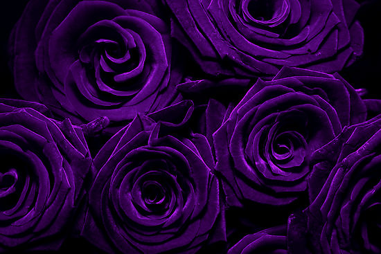
•Purple-Suggests dignity, spirituality, royal, luxury, wealth, authority, mournfulness, and sophistication. In business it is upscale. Purple is favored by the artistic.
•White-Suggests truthfulness, purity, clean, devotion, mild, and contemporary. White is the best color for a background color on the web. For business it can be refreshing and sterile.

•Orange-Suggests playfulness, pleasure, cool, warmth, cheer, vibrant, strength, endurance, and ambition.

•Pink-Suggests softness, sweet, femininity, well-being, innocence, and nurture.

•Gold-Suggests expensive, and prestige.
